.webp)
Features
Max Reed Portfolio
A preview-led features prompt for generating a polished AI-built interface.
by MotionSites View full prompt
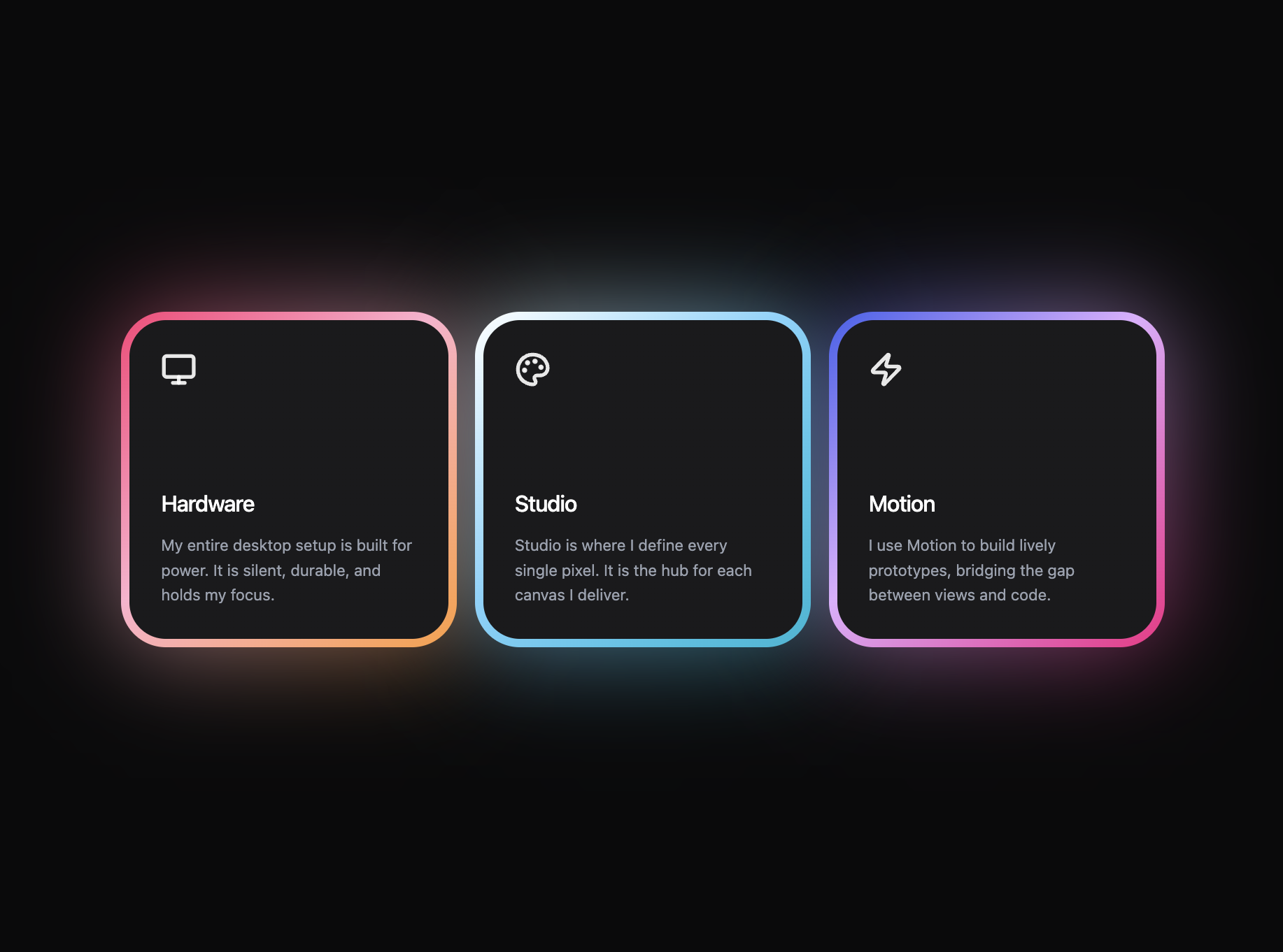
A preview-led features section prompt for generating a polished AI-built interface.
Direct delivery
415 words · 51 linesCreate a React web application using Vite and Tailwind CSS v4 that perfectly replicates a dark-themed glowing feature card section.
**Libraries Required:**
- React 19, Vite, Tailwind CSS v4
- `lucide-react` for icons
- `motion/react` (Framer Motion) for animations
**Global Page Layout:**
- Set the main wrapper to `min-h-screen bg-[#0A0A0B] flex flex-col items-center justify-center p-6 md:p-12 font-sans`.
- Create a CSS grid to hold the cards: `grid grid-cols-1 md:grid-cols-3 gap-10 md:gap-3 lg:gap-3 w-full max-w-[936px]`.
**The Feature Card Component Requirements:**
- Build a reusable `<FeatureCard />` component taking `title`, `description`, `icon`, `gradient`, and `delay` props.
- Wrap the entire card in a `<motion.div>`.
- Card size restrictions wrapper: `relative flex flex-col justify-start items-start w-full max-w-[260px] md:max-w-[300px] group mx-auto`.
- **Glow Background (Crucial):** Create an absolute positioned `div` behind the card content with `w-full h-[260px] md:h-[300px] opacity-60 rounded-[40px] pointer-events-none`. Apply inline styles: `background: gradient` and `filter: "blur(45px)"`.
- **Foreground Card with Gradient Border (Crucial):** On top of the glow, create a relative container with `self-stretch h-[260px] md:h-[300px] rounded-[40px] z-10 overflow-hidden`.
- Apply an 8px solid transparent border to this foreground card.
- Use the background-clip technique strictly for the border gradient via inline styles:
`background: linear-gradient(#1A1A1C, #1A1A1C) padding-box, ${gradient} border-box;`
- Content Inner Layout: Inside the foreground, use `w-full h-full p-7 flex flex-col justify-between`.
- Icons should have `size={32}` and `strokeWidth={2.5}`, wrapped in a `text-white/90` div.
- Titles: `text-white font-medium text-xl mb-3 tracking-tight`.
- Descriptions: `text-gray-400 text-[14px] leading-[1.6] font-normal selection:bg-white/20`.
**Animations (Framer Motion):**
- The main `<motion.div>` wrapper should animate as follows:
- Initial state: `{ opacity: 0, y: 30 }`
- Animate state: `{ opacity: 1, y: 0 }`
- Transition: `{ duration: 0.8, ease: "easeOut", delay }`
**Data for the 3 Cards:**
Instantiate three of these cards inside the main grid with the following exact data:
1. **Card 1 ("Hardware"):**
- Icon: `<Monitor />` from lucide-react.
- Delay: `0.1`
- Description: "My entire desktop setup is built for power. It is silent, durable, and holds my focus."
- Gradient: `linear-gradient(137deg, #FF3D77 0%, #FFB1CE 45%, #FF9D3C 100%)`
2. **Card 2 ("Studio"):**
- Icon: `<Palette />` from lucide-react.
- Delay: `0.2`
- Description: "Studio is where I define every single pixel. It is the hub for each canvas I deliver."
- Gradient: `linear-gradient(137deg, #FFFFFF 0%, #7DD3FC 45%, #06B6D4 100%)`
3. **Card 3 ("Motion"):**
- Icon: `<Zap />` from lucide-react.
- Delay: `0.3`
- Description: "I use Motion to build lively prototypes, bridging the gap between views and code."
- Gradient: `linear-gradient(137deg, #4361EE 0%, #E0AEFF 45%, #F72585 100%)`Keep exploring
A preview-led features prompt for generating a polished AI-built interface.
A preview-led footer section prompt for generating a polished AI-built interface.
A preview-led email marketing prompt for generating a polished AI-built interface.