.webp)
Features
Max Reed Portfolio
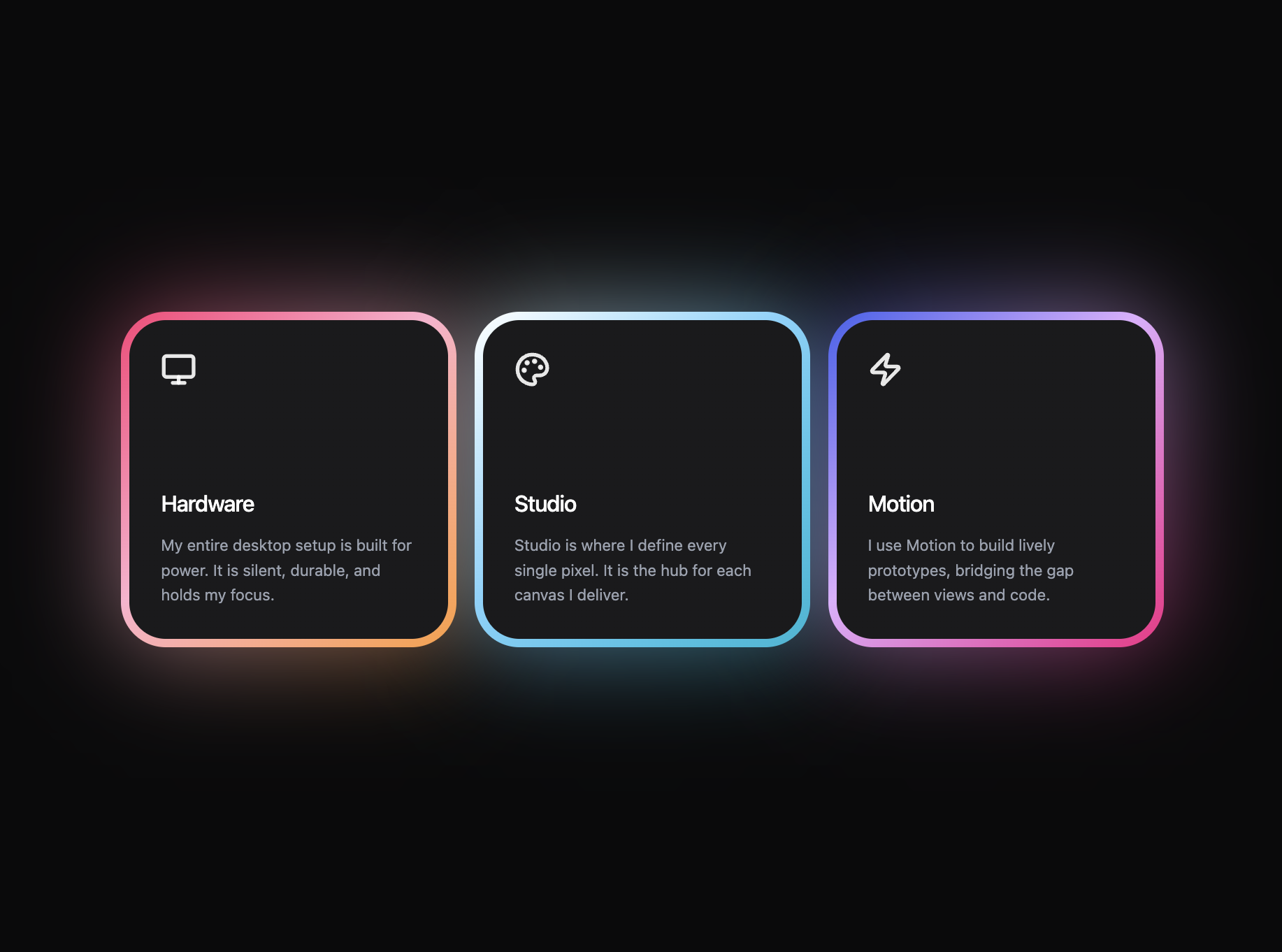
A preview-led features prompt for generating a polished AI-built interface.
by MotionSites View full prompt
.webp)
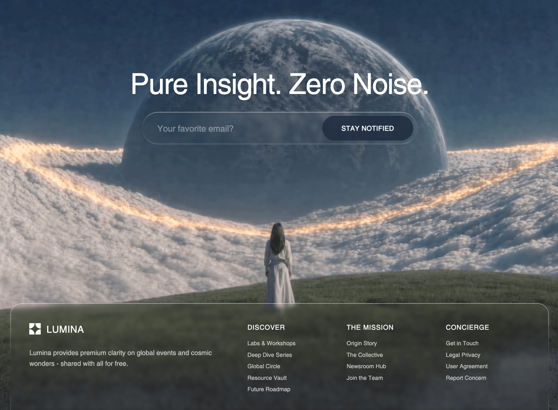
A preview-led about prompt for generating a polished AI-built interface.
Direct delivery
481 words · 72 linesBuild a single React component for an "About" section using Tailwind CSS. Use `lucide-react` for the ArrowRight icon. System font stack only (no custom fonts). Match every detail exactly: --- ### Outer wrapper `<section>` with `bg-white pt-16 sm:pt-20 lg:pt-32 pb-12 sm:pb-16 lg:pb-24 overflow-hidden`. Inner container: `max-w-[1440px] mx-auto`. --- ### Badge row `px-5 sm:px-8 lg:px-12 flex items-center gap-3 mb-6 sm:mb-8`. - **Numbered circle:** `w-6 h-6 sm:w-7 sm:h-7 rounded-full bg-gray-900 text-white flex items-center justify-center text-[11px] sm:text-[12px] font-semibold`. Displays "1". - **Pill label:** Text "Introducing Axion". `text-[12px] sm:text-[13px] font-medium rounded-full px-3 sm:px-4 py-1 sm:py-1.5`. No border, no background. --- ### Heading `<h2>` with `px-5 sm:px-8 lg:px-12 text-[clamp(1.5rem,4vw,3.2rem)] font-medium leading-[1.12] tracking-[-0.02em] text-gray-900 mb-12 sm:mb-16 lg:mb-28`. Text: "Strategy-led creatives, delivering / results in digital and beyond." - the `/` represents a line break that is `<br className="hidden sm:block" />` with a `<span className="sm:hidden"> </span>` fallback space before it (so on mobile it reads as one flowing line, on sm+ it breaks into two lines). --- ### Content area - MOBILE / TABLET layout (lg:hidden) Wrapper: `lg:hidden px-5 sm:px-8`. 1. **Paragraph:** "Through research, creative thinking and iteration we help growing brands realize their digital full potential." - `text-[15px] sm:text-[17px] leading-[1.6] font-medium text-gray-900 mb-6`. 2. **CTA button** (inside a `mb-8` wrapper): Orange button (`bg-[#F26522] hover:bg-[#e05a1a]`) with text "About our studio", `text-white text-[13px] sm:text-[14px] font-medium rounded-full pl-5 sm:pl-6 pr-2 py-2 flex items-center gap-3`. Contains: - **Text-roll hover animation:** The button text is inside `overflow-hidden h-[20px]` > `flex flex-col` container. The text is duplicated (two identical `h-[20px] flex items-center` spans). On `group-hover`, the flex-col translates `-translate-y-1/2` with `transition-transform duration-500 ease-[cubic-bezier(0.25,0.1,0.25,1)]`. - **Arrow circle:** White circle `bg-white w-7 h-7 sm:w-8 sm:h-8 rounded-full flex items-center justify-center`. Contains `ArrowRight` from lucide-react (size 14), `text-[#F26522]`, starts at `-rotate-45`, on `group-hover` rotates to `rotate-0` (same duration-500 easing). The entire button has `className="group"`. 3. **Images:** `flex flex-col sm:flex-row gap-4 sm:gap-5`. - First: `sm:w-[45%]`, `<img>` with `w-full aspect-[438/346] rounded-xl sm:rounded-2xl object-cover`. - Second: `sm:w-[55%]`, `<img>` with `w-full aspect-[900/600] rounded-xl sm:rounded-2xl object-cover`. --- ### Content area - DESKTOP layout (hidden lg:grid) Wrapper: `hidden lg:grid grid-cols-[26%_1fr_48%] items-end gap-6 xl:gap-8 px-5 sm:px-8 lg:px-12`. - **Left column** (`self-end`): Small image, `w-full aspect-[438/346] rounded-2xl object-cover`. - **Center column** (`self-start flex flex-col justify-end`): - Paragraph: `text-[16px] xl:text-[18px] leading-[1.65] font-medium text-gray-900 whitespace-nowrap mb-6`. Text with explicit `<br/>` tags: "Through research, creative thinking`<br/>`and iteration we help growing brands`<br/>`realize their digital full potential." - Same orange CTA button as mobile (identical text-roll animation). - **Right column** (`self-end`): Large image, `w-full aspect-[3/2] rounded-2xl object-cover`. --- ### Image URLs - **Small image:** `https://images.higgs.ai/?default=1&output=webp&url=https%3A%2F%2Fd8j0ntlcm91z4.cloudfront.net%2Fuser_38xzZboKViGWJOttwIXH07lWA1P%2Fhf_20260516_090123_74be96d4-9c1b-40cf-932a-96f4f4babed3.png&w=1280&q=85` - **Large image:** `https://images.higgs.ai/?default=1&output=webp&url=https%3A%2F%2Fd8j0ntlcm91z4.cloudfront.net%2Fuser_38xzZboKViGWJOttwIXH07lWA1P%2Fhf_20260516_090133_c157d30b-a99a-4477-bec1-a446149ec3f2.png&w=1280&q=85` --- ### Technical details - **Framework:** React 18 + TypeScript + Tailwind CSS 3.4 (default config, no custom theme extensions) - **Icons:** `ArrowRight` from `lucide-react` - **Font:** System default (no custom font loaded) - **All hover animations:** `duration-500 ease-[cubic-bezier(0.25,0.1,0.25,1)]` - **Max content width:** 1440px, centered with `mx-auto` - **Responsive breakpoints:** Default Tailwind (sm: 640px, md: 768px, lg: 1024px, xl: 1280px) ---
Keep exploring
A preview-led features prompt for generating a polished AI-built interface.
A preview-led features section prompt for generating a polished AI-built interface.
A preview-led footer section prompt for generating a polished AI-built interface.
.%20Match%20every%20detail%20exactly%3A%0A%0A---%0A%0A%23%23%23%20Outer%20wrapper%0A%0A%60%3Csection%3E%60%20with%20%60bg-white%20pt-16%20sm%3Apt-20%20lg%3Apt-32%20pb-12%20sm%3Apb-16%20lg%3Apb-24%20overflow-hidden%60.%20Inner%20container%3A%20%60max-w-%5B1440px%5D%20mx-auto%60.%0A%0A---%0A%0A%23%23%23%20Badge%20row%0A%0A%60px-5%20sm%3Apx-8%20lg%3Apx-12%20flex%20items-center%20gap-3%20mb-6%20sm%3Amb-8%60.%0A%0A-%20**Numbered%20circle%3A**%20%60w-6%20h-6%20sm%3Aw-7%20sm%3Ah-7%20rounded-full%20bg-gray-900%20text-white%20flex%20items-center%20justify-center%20text-%5B11px%5D%20sm%3Atext-%5B12px%5D%20font-semibold%60.%20Displays%20%221%22.%0A-%20**Pill%20label%3A**%20Text%20%22Introducing%20Axion%22.%20%60text-%5B12px%5D%20sm%3Atext-%5B13px%5D%20font-medium%20rounded-full%20px-3%20sm%3Apx-4%20py-1%20sm%3Apy-1.5%60.%20No%20border%2C%20no%20background.%0A%0A---%0A%0A%23%23%23%20Heading%0A%0A%60%3Ch2%3E%60%20with%20%60px-5%20sm%3Apx-8%20lg%3Apx-12%20text-%5Bclamp(1.5rem%2C4vw%2C3.2rem)%5D%20font-medium%20leading-%5B1.12%5D%20tracking-%5B-0.02em%5D%20text-gray-900%20mb-12%20sm%3Amb-16%20lg%3Amb-28%60.%0A%0AText%3A%20%22Strategy-led%20creatives%2C%20delivering%20%2F%20results%20in%20digital%20and%20beyond.%22%20-%20the%20%60%2F%60%20represents%20a%20line%20break%20that%20is%20%60%3Cbr%20className%3D%22hidden%20sm%3Ablock%22%20%2F%3E%60%20with%20a%20%60%3Cspan%20className%3D%22sm%3Ahidden%22%3E%20%3C%2Fspan%3E%60%20fallback%20space%20before%20it%20(so%20on%20mobile%20it%20reads%20as%20one%20flowing%20line%2C%20on%20sm%2B%20it%20breaks%20into%20two%20lines).%0A%0A---%0A%0A%23%23%23%20Content%20area%20-%20MOBILE%20%2F%20TABLET%20layout%20(lg%3Ahidden)%0A%0AWrapper%3A%20%60lg%3Ahidden%20px-5%20sm%3Apx-8%60.%0A%0A1.%20**Paragraph%3A**%20%22Through%20research%2C%20creative%20thinking%20and%20iteration%20we%20help%20growing%20brands%20realize%20their%20digital%20full%20potential.%22%20-%20%60text-%5B15px%5D%20sm%3Atext-%5B17px%5D%20leading-%5B1.6%5D%20font-medium%20text-gray-900%20mb-6%60.%0A%0A2.%20**CTA%20button**%20(inside%20a%20%60mb-8%60%20wrapper)%3A%20Orange%20button%20(%60bg-%5B%23F26522%5D%20hover%3Abg-%5B%23e05a1a%5D%60)%20with%20text%20%22About%20our%20studio%22%2C%20%60text-white%20text-%5B13px%5D%20sm%3Atext-%5B14px%5D%20font-medium%20rounded-full%20pl-5%20sm%3Apl-6%20pr-2%20py-2%20flex%20items-center%20gap-3%60.%20Contains%3A%0A%20%20%20-%20**Text-roll%20hover%20animation%3A**%20The%20button%20text%20is%20inside%20%60overflow-hidden%20h-%5B20px%5D%60%20%3E%20%60flex%20flex-col%60%20container.%20The%20text%20is%20duplicated%20(two%20identical%20%60h-%5B20px%5D%20flex%20items-center%60%20spans).%20On%20%60group-hover%60%2C%20the%20flex-col%20translates%20%60-translate-y-1%2F2%60%20with%20%60transition-transform%20duration-500%20ease-%5Bcubic-bezier(0.25%2C0.1%2C0.25%2C1)%5D%60.%0A%20%20%20-%20**Arrow%20circle%3A**%20White%20circle%20%60bg-white%20w-7%20h-7%20sm%3Aw-8%20sm%3Ah-8%20rounded-full%20flex%20items-center%20justify-center%60.%20Contains%20%60ArrowRight%60%20from%20lucide-react%20(size%2014)%2C%20%60text-%5B%23F26522%5D%60%2C%20starts%20at%20%60-rotate-45%60%2C%20on%20%60group-hover%60%20rotates%20to%20%60rotate-0%60%20(same%20duration-500%20easing).%20The%20entire%20button%20has%20%60className%3D%22group%22%60.%0A%0A3.%20**Images%3A**%20%60flex%20flex-col%20sm%3Aflex-row%20gap-4%20sm%3Agap-5%60.%0A%20%20%20-%20First%3A%20%60sm%3Aw-%5B45%25%5D%60%2C%20%60%3Cimg%3E%60%20with%20%60w-full%20aspect-%5B438%2F346%5D%20rounded-xl%20sm%3Arounded-2xl%20object-cover%60.%0A%20%20%20-%20Second%3A%20%60sm%3Aw-%5B55%25%5D%60%2C%20%60%3Cimg%3E%60%20with%20%60w-full%20aspect-%5B900%2F600%5D%20rounded-xl%20sm%3Arounded-2xl%20object-cover%60.%0A%0A---%0A%0A%23%23%23%20Content%20area%20-%20DESKTOP%20layout%20(hidden%20lg%3Agrid)%0A%0AWrapper%3A%20%60hidden%20lg%3Agrid%20grid-cols-%5B26%25_1fr_48%25%5D%20items-end%20gap-6%20xl%3Agap-8%20px-5%20sm%3Apx-8%20lg%3Apx-12%60.%0A%0A-%20**Left%20column**%20(%60self-end%60)%3A%20Small%20image%2C%20%60w-full%20aspect-%5B438%2F346%5D%20rounded-2xl%20object-cover%60.%0A-%20**Center%20column**%20(%60self-start%20flex%20flex-col%20justify-end%60)%3A%0A%20%20-%20Paragraph%3A%20%60text-%5B16px%5D%20xl%3Atext-%5B18px%5D%20leading-%5B1.65%5D%20font-medium%20text-gray-900%20whitespace-nowrap%20mb-6%60.%20Text%20with%20explicit%20%60%3Cbr%2F%3E%60%20tags%3A%20%22Through%20research%2C%20creative%20thinking%60%3Cbr%2F%3E%60and%20iteration%20we%20help%20growing%20brands%60%3Cbr%2F%3E%60realize%20their%20digital%20full%20potential.%22%0A%20%20-%20Same%20orange%20CTA%20button%20as%20mobile%20(identical%20text-roll%20animation).%0A-%20**Right%20column**%20(%60self-end%60)%3A%20Large%20image%2C%20%60w-full%20aspect-%5B3%2F2%5D%20rounded-2xl%20object-cover%60.%0A%0A---%0A%0A%23%23%23%20Image%20URLs%0A%0A-%20**Small%20image%3A**%20%60https%3A%2F%2Fimages.higgs.ai%2F%3Fdefault%3D1%26output%3Dwebp%26url%3Dhttps%253A%252F%252Fd8j0ntlcm91z4.cloudfront.net%252Fuser_38xzZboKViGWJOttwIXH07lWA1P%252Fhf_20260516_090123_74be96d4-9c1b-40cf-932a-96f4f4babed3.png%26w%3D1280%26q%3D85%60%0A-%20**Large%20image%3A**%20%60https%3A%2F%2Fimages.higgs.ai%2F%3Fdefault%3D1%26output%3Dwebp%26url%3Dhttps%253A%252F%252Fd8j0ntlcm91z4.cloudfront.net%252Fuser_38xzZboKViGWJOttwIXH07lWA1P%252Fhf_20260516_090133_c157d30b-a99a-4477-bec1-a446149ec3f2.png%26w%3D1280%26q%3D85%60%0A%0A---%0A%0A%23%23%23%20Technical%20details%0A%0A-%20**Framework%3A**%20React%2018%20%2B%20TypeScript%20%2B%20Tailwind%20CSS%203.4%20(default%20config%2C%20no%20custom%20theme%20extensions)%0A-%20**Icons%3A**%20%60ArrowRight%60%20from%20%60lucide-react%60%0A-%20**Font%3A**%20System%20default%20(no%20custom%20font%20loaded)%0A-%20**All%20hover%20animations%3A**%20%60duration-500%20ease-%5Bcubic-bezier(0.25%2C0.1%2C0.25%2C1)%5D%60%0A-%20**Max%20content%20width%3A**%201440px%2C%20centered%20with%20%60mx-auto%60%0A-%20**Responsive%20breakpoints%3A**%20Default%20Tailwind%20(sm%3A%20640px%2C%20md%3A%20768px%2C%20lg%3A%201024px%2C%20xl%3A%201280px)%0A%0A---&model=Seedance%202.5%20Pro)